UX / UI · Mobile App

IBM
Doc Buddy

My Role Design Lead (project-based)
Team 6 Developers + Customer Service
Platform iOS & Android
The challenge

From "make it better" to "what do we do next?"
Reposition design from execution to problem definition — and establish it as a trusted starting point for the team

A mockup isn't a brief

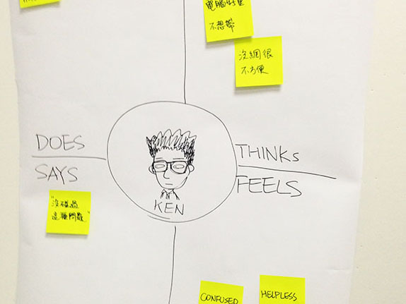
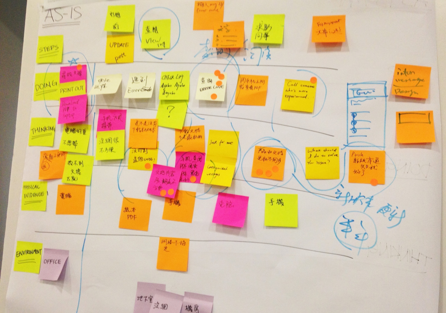
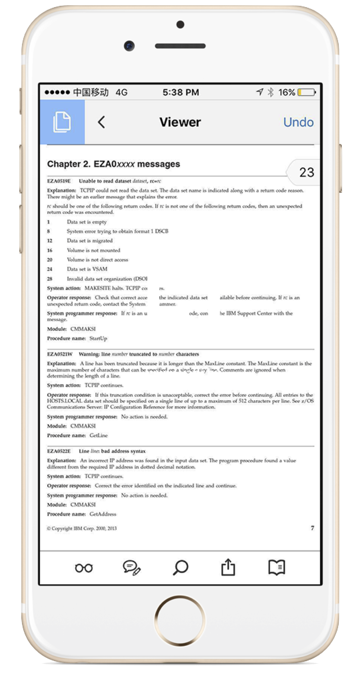
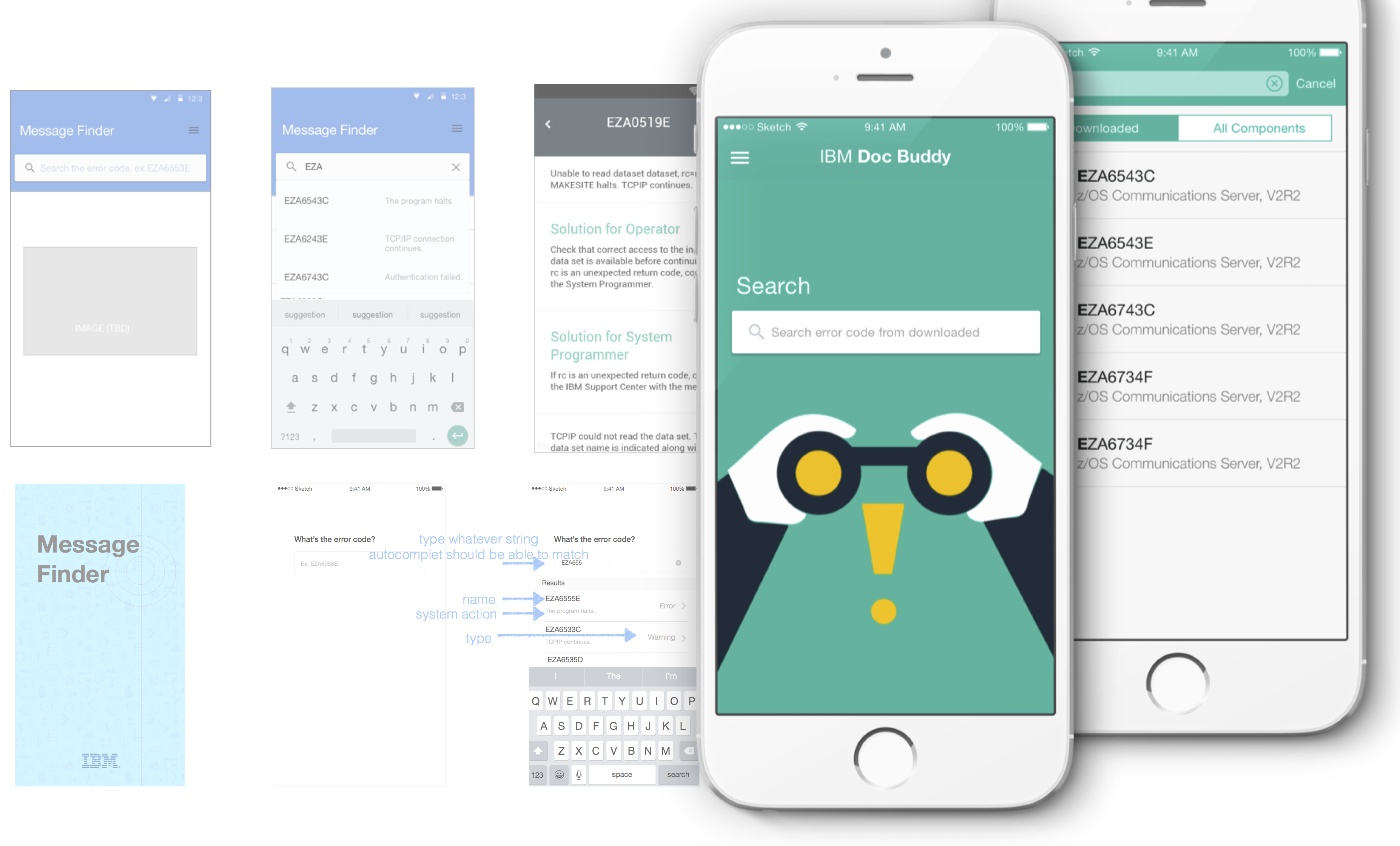
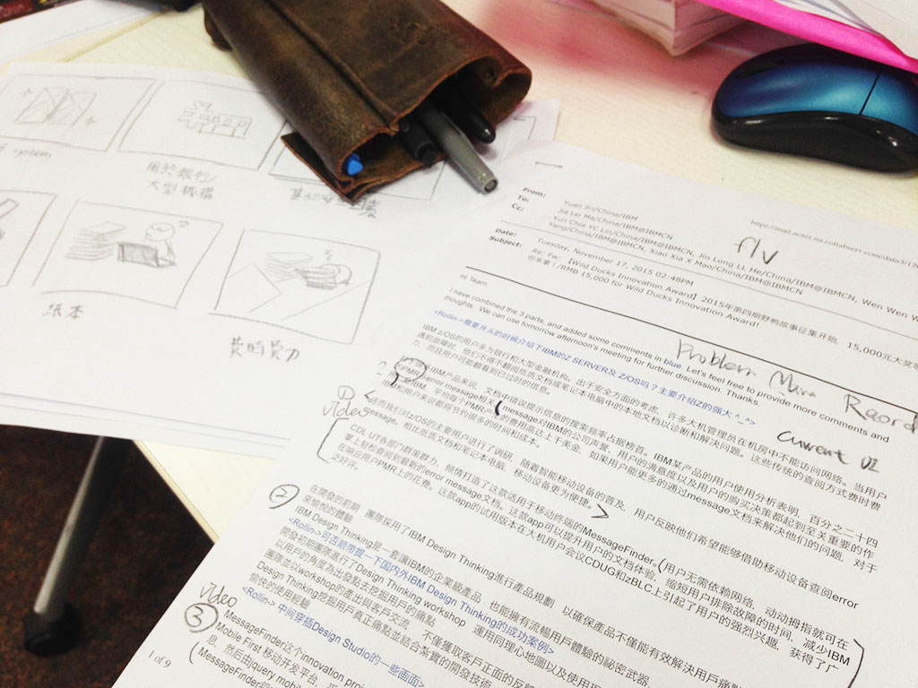
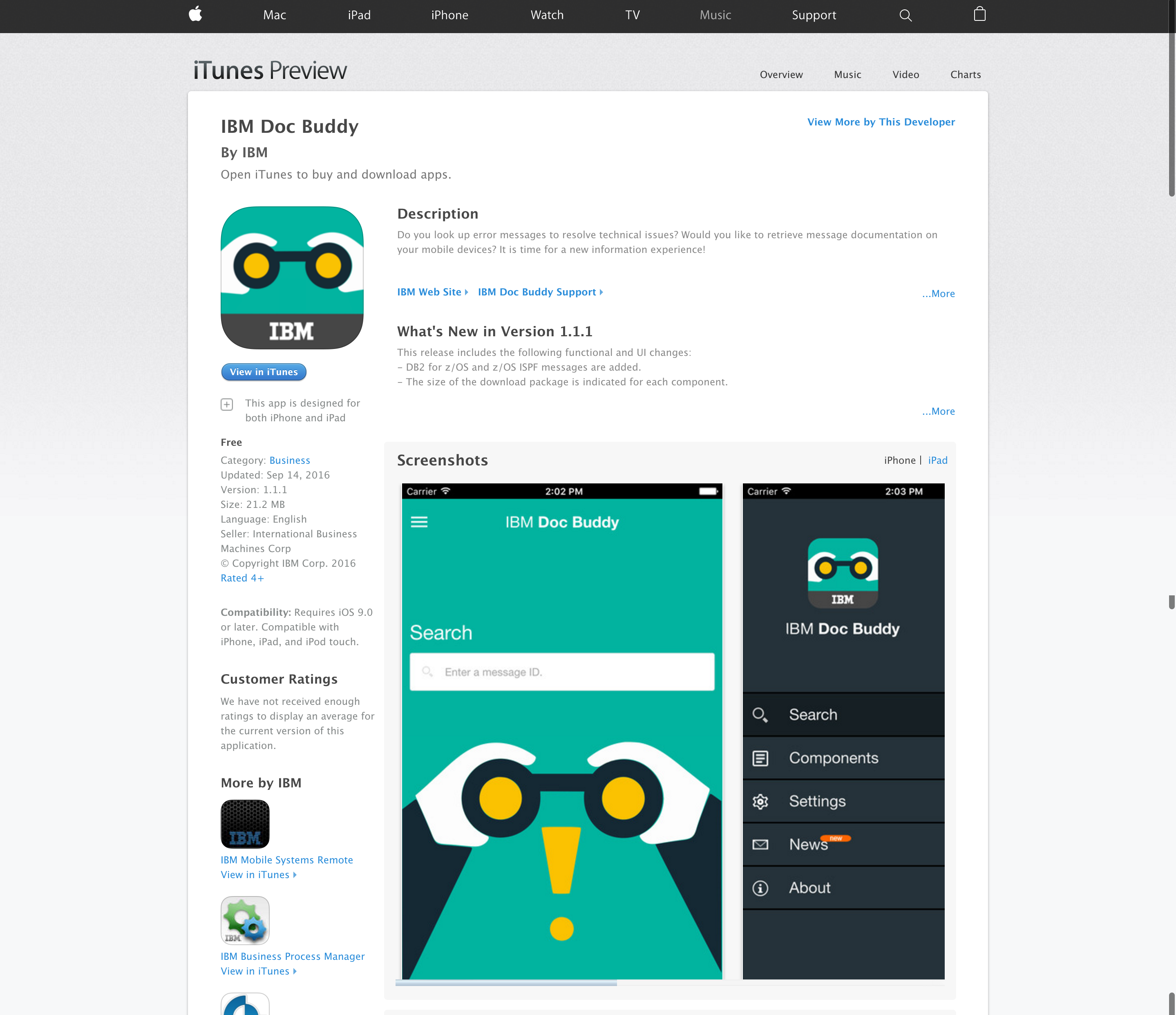
One day, design received a request from an external team. Their clients had a problem — and a solution had already been proposed: a mockup. The ask for design was straightforward: make it look better.

The pre-made mockup that arrived with the brief

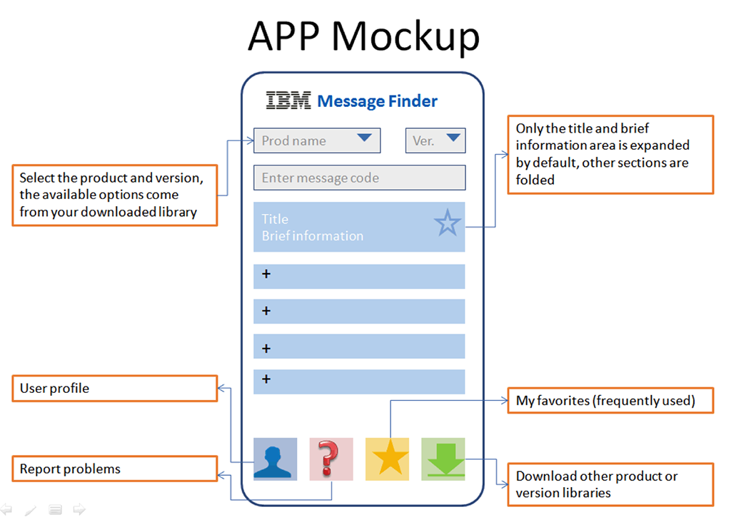
Building an app may be an obvious response, but it is not a silver bullet. Why do people need this app? What problem are we actually trying to solve?

Design Thinking
in a giant tech company

I organised a short IBM Design Thinking workshop and adapted the format so non-designers could engage with it quickly. The goal was to create enough shared understanding for the team to question the existing direction.


Using personas, empathy maps, and an AS-IS journey map, the team began to see the problem differently — uncovering gaps and opportunities that had previously gone unnoticed. It became clear that the initial solution might not be the right one.

Empathy Map from the workshop
Design Thinking workshop in action
User Journey Map

The strongest signal came afterwards:

a non-designer colleague took the AS-IS map into client conversations. The artefacts had become a shared decision-making tool.

The real problem
was mobility

By mapping the user journey and validating it with client feedback, the team identified a fundamental issue: the current platform was not designed for a mobile-first experience.


The direction became clear — redesign the information architecture so users can find what they need within three taps, on mobile.

Poor experience on mobile

Redesigning
the information architecture

I redesigned the information architecture to organise content around user tasks rather than internal logic. I then translated that structure into mobile-first flows and interfaces, aligned with IBM Design Language.

Interface overview
Redesigned information architecture flow
UI screen set

I also produced detailed annotations for handoff, making behaviours and edge cases explicit for developers. By that point, the team had fully shifted direction — the original mockup was no longer part of the conversation, and everyone was aligned around building the right thing.

Detailed design annotations for handoff

Producing the
internal launch video

I was also responsible for producing the internal campaign video — from writing the script to directing the shoot.

Video script writing
Video shoot

From execution
to direction

"What should we do next?"

— Tech Lead

By the end of the project, the question was no longer "make it better" — but "what should we do next?" This reflected a deeper shift: design was no longer treated as an execution step, but as a driver of direction.

The app was successfully launched on the App Store and Google Play, marking a key milestone for the team. It was also recognised by senior stakeholders, reinforcing the value of the approach.

"A great milestone for our z Systems product documentation."

— VP, zSystem Software · IBM

"A very impressive tool. This will be well received by tech sellers and customers alike."

— z Software Technical Sales Leader

IBM Doc Buddy on the App Store
← Previous Driver App Redesign Next → Field Report