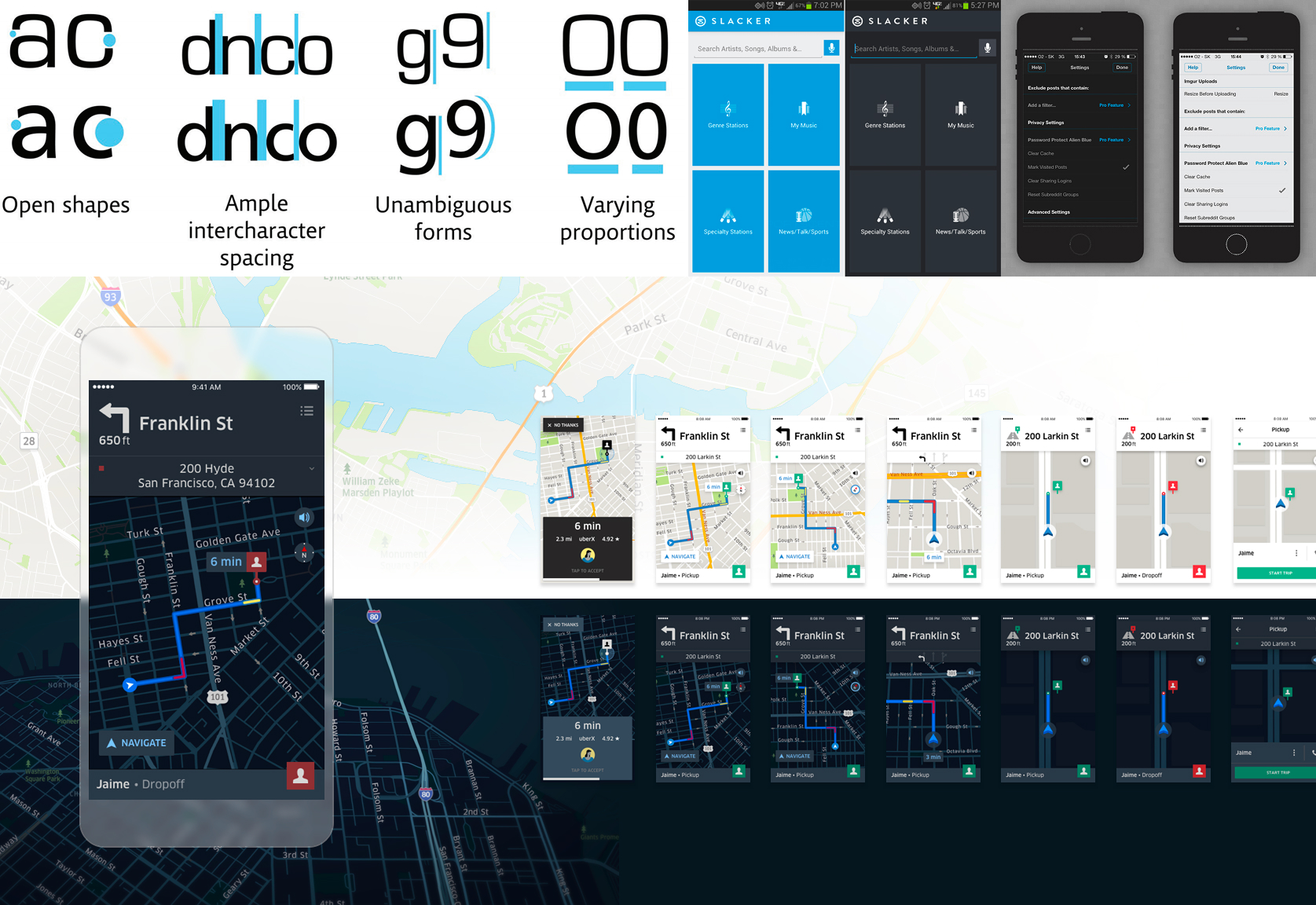
UX / UI · Mobile App

Driver App
Redesign

My Role UX/UI Designer
Platform Android
Industry Private Hire / Transport
Duration 3 months
The challenge

How might we improve the Driver App so drivers are more successful at delivering good service as well as achieving their goals — creating a win-win for customers, drivers, and the business?

A complete redesign of the tool drivers depend on every day

A London-based premium private hire company operates a large fleet of professional drivers across the city. The existing Driver App was the central tool through which drivers received jobs, tracked earnings, and communicated with support — yet it was failing at all three.

I was brought in to diagnose the problems and redesign the product end-to-end — navigating a complex stakeholder ecosystem of call center agents, operations staff, and passengers, while keeping the driver at the centre. They are the only people customers ever actually meet, and without them, there is no business.

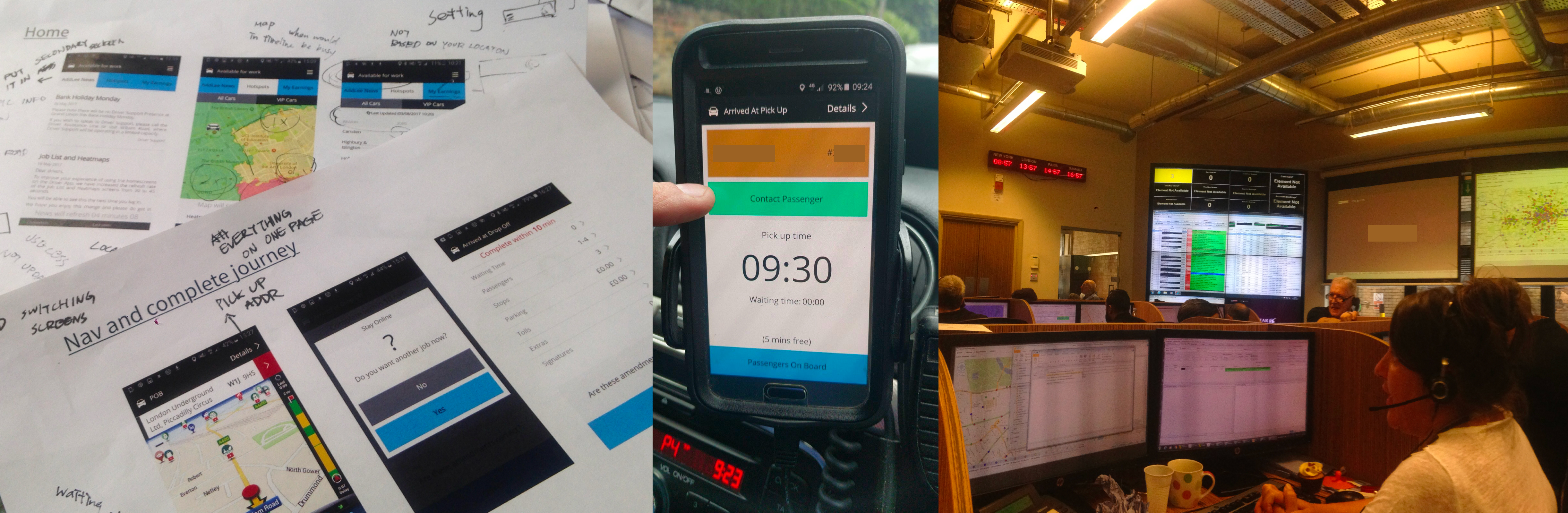
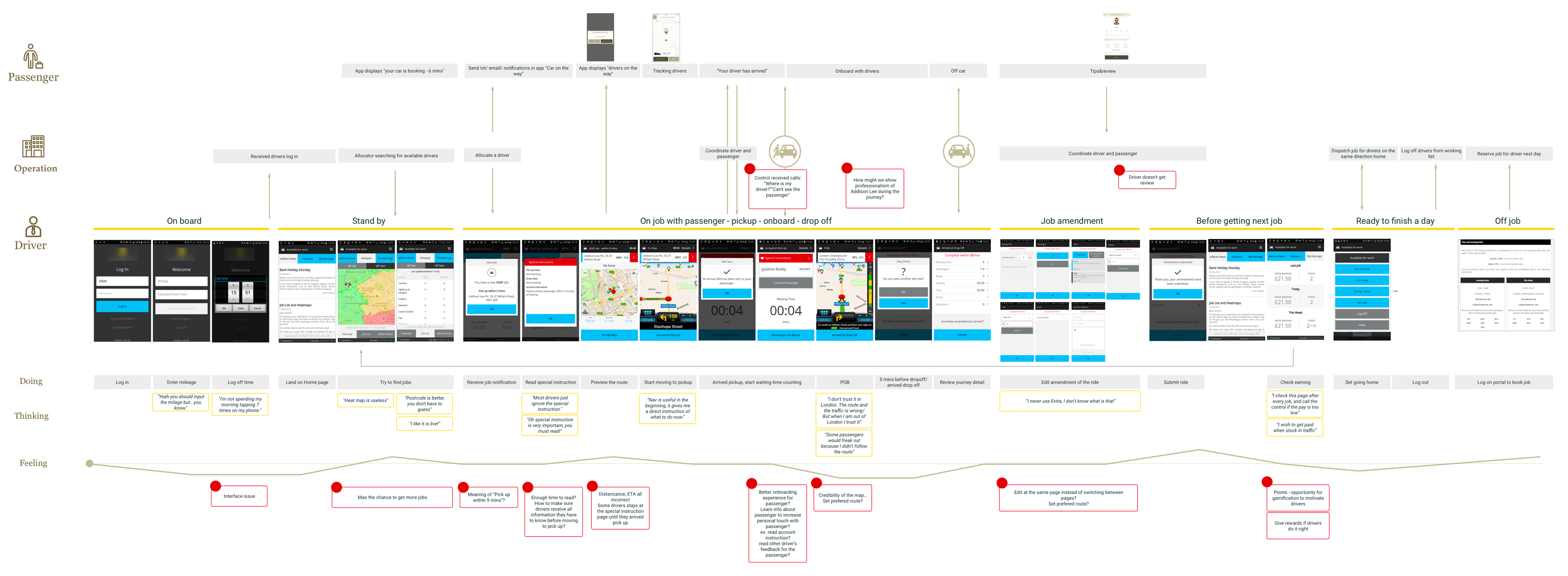
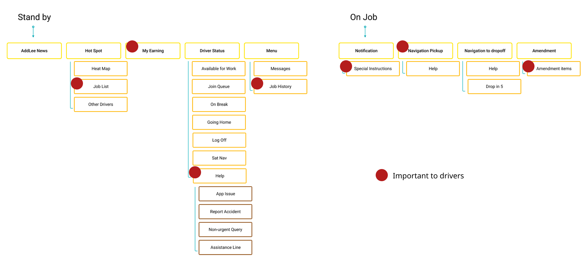
Getting in the car to understand the job

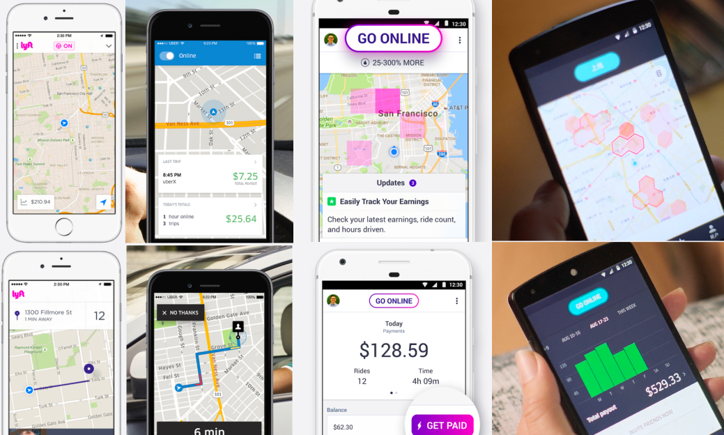
I got in cabs with drivers, sat with call center agents, attended driver training, and read through App Store reviews to understand where the experience was breaking down.

Shadowing the operations and support teams was equally important — drivers don't exist in isolation, and understanding the full ecosystem was the only way to design something that worked for everyone in it.

Discovery research — field sessions and ride-alongs

Designing for a driver on the move

🚗
The Driver
Demographics
95% male, middle-aged
Tech comfort
Later adopter to smartphones
Physical context
One hand, arm's length, phone on dash rack
Experience
3–5+ years with the company, familiar with the old system's quirks

Goals & Motivations

  • Maximise earnings — hit the weekly target
  • Know where and when to position for jobs
  • Avoid traffic and plan the day efficiently
  • Understand their own performance and ratings

Frustrations & Constraints

  • Uses a second device just for navigation (doesn't trust the built-in map)
  • Job List is the #1 priority but buried 2 taps deep
  • Limited ways to contact passengers directly
  • Poor feedback loop — never sees customer reviews

Mental Model & Context

  • Knows London postcodes well — a natural navigator
  • Receives jobs auto-allocated by the system, not self-selecting
  • Often communicates with support multiple times per shift

Mapping the full journey to find where it breaks

Mapping the journey across three actors — Passenger, Company, and Driver — made one thing clear: the problems weren't isolated. Every time a driver struggled, it created a ripple through the entire system.

Almost every step of the core on-job workflow carried a pain point. The redesign couldn't be a collection of individual fixes — it needed a strategy that addressed the underlying causes.

User Journey Map — Passenger, Company, and Driver swimlanes with pain points
Log in
"I am not spending my morning tapping 7 times on my phone."
Stand by
"Heatmap is useless."
"Postcode is more useful, you don't have to guess."
When driving
"Some passenger would freak out because I didn't follow the route."
After drop-off
"I check this page after every job, and call the control if the pay is too low."

Four problems undermining every shift

01
Poor Information Architecture

The landing page was a news feed that nobody read. The most important section — the Job List — required two taps to reach. Help and Job History were buried in a hamburger menu that mixed critical and trivial functions together.

02
Confusing Visual Language

Different UI patterns coexisted without coherence. Colours carried no consistent meaning. Red appeared for both errors and standard buttons. Drivers couldn't glance and act.

03
Broken Navigation & Mapping

The built-in map was unreliable and drivers didn't trust it — so they carried a second phone purely for navigation.

"The navigation is bad! I don't trust it!"
04
App Crashes & Instability

Frequent crashes during the most stressful moments — arriving at pickup, submitting amendments — destroyed driver trust and increased support call volume. Instability was both a technical and experience problem.

Information Architecture — current app IA with starred driver priorities

What other driver apps were already doing right

I benchmarked leading ride-hailing driver apps across three areas: exploring jobs, the pickup experience, and earnings. Both had solved glanceability far more effectively than our app — letting drivers act without reading.

Competitor Analysis — ride-hailing driver app screens

Three principles to guide every decision

🗂

Restructure the information architecture

Make the most important information immediately accessible within 3 taps. Navigation should reflect what drivers actually care about: jobs, earnings, and communication.

👁

Design for glanceability & tappability

The interface should work for drivers. Every element is recognisable at a glance, readable in a second, tappable with one thumb.

Standard patterns reduce cognitive load; consistency builds trust.

🤝

Make communication transparent

Help drivers achieve their goals — more jobs, better pay, stronger ratings — by surfacing the data the system already holds. Drivers shouldn't have to guess what the company already knows.

The redesign

Evolve, don't revolutionise — familiar enough to trust, refined enough to work.

Redefine information hierarchy

Restructure around the driver's real priorities

  • Jobs, earnings, and communication promoted to the main navigation
  • Unified colour scheme and components across every screen, so the app feels coherent and trustworthy
New IA — bottom tab nav overview
IA overview
Make communication transparent

Give drivers the intelligence to make better decisions

  • Show job demand, weather, and traffic so drivers can position themselves where and when it matters most
  • All data already lives in the system — the redesign puts it in front of the driver, removing the guesswork
Before
Old home screen
After
New home screen
Improve usability

Big, round, glanceable, tappable — designed for drivers' eyes and hands

  • Large circular icon buttons — recognisable at a glance, tappable with one thumb
  • Every task completable within 3 taps, reducing cognitive load while driving
Before
Before — flat list buttons
After
After — circular icon buttons
New feature

Personal touch — better engagement

"I would love to see my reviews from customers, either good or bad, so I can improve my job."
New feature — driver ratings and engagement screens
Night mode

A dark theme designed for safety
Not just for aesthetic

Many drivers work nights. Bright white screens cause eye strain and reduce night vision — and drivers expressed a clear preference for a darker interface even during the day.

Day mode Night mode

Effective dark mode: low saturation, reduced contrast, and typography that holds legibility in low light.

Night mode research

Two dark mode palettes explored — a warm neutral grey and a cool navy blue.

Neutral Grey
Neutral grey night mode
Cool Blue
Cool blue night mode

Testing with real drivers

To test which palette felt more natural at night, I brought drivers into a corner office and covered the windows to replicate evening street light conditions.

I expected the neutral grey to win — softer, easier on the eyes. Surprisingly, every driver chose the cool blue. They said the tone matched how they actually see at night.

Usability testing — Samsung device, prototype, evening session

In their words

"Chia will deep dive into the user experience and drill down any pain points. She spent hours with our drivers and couriers (even on a motorbike) to make sure she understood their day to day. She always puts user experience first and is not afraid to take risks. Her ideas for new features really blew some of the team's minds, and the elegance in which they were delivered was astounding."

— Product Manager, Driver App Project

"When can I get it?"

— Drivers, every time we met

← Previous Employee Manager Next → IBM Doc Buddy